PathFactory, January 2020 - May 2021How might we use websites for intelligent content marketing?
About this project
Summary
Meant as a tool for content and digital marketers, Website Tools provide a way for users to better leverage their websites in their content and marketing strategies.
Website Tools is also a new product offering that introduces an additional revenue stream to the company. Previous versions of this product were met with mixed success. This current project’s goal is to deliver an improved version that is built on an improved backend architecture within a short time period.
Given that the project occurred during the COVID-19 pandemic, marketers are relying on their digital assets to continue to drive business. However, marketers typically rely on separate web development teams to make changes, adding friction to each strategy. Website Tools is in a unique position to be able to solve this problem.
Team & Contribution
As a product designer a PathFactory, I worked with our internal development and external engineering partners to deliver this product. Our collective teams are distributed all over the world, with the core team in Toronto and the majority of our engineering partners in India. As this project occurred during the onset of the COVID-19 pandemic, our work moved from a hybrid on-site/remote process to a fully remote process.
My responsibilities included:
Facilitation & Discovery
Information Architecture
Ideation & Prototyping
UX & UI Design
Evaluative Research
Websites are key real estate for marketing teams, but they aren't utilized to their full potential. With emerging technologies, Website Tools transforms websites into a more effective marketing channel.
Updated information architecture
Methods: product audit, card sorting, internal stakeholder discussions
While conducting a product audit and internal interviews, my team and I noticed that there was confusion regarding how our product was organized as a result of ambiguous naming conventions, outgrowing our architecture, and fuzzy distinctions between old products and new products.
To learn more, we decided to conduct card sorting exercises with internal users and customer success managers to answer the following questions:
How do our marketing users see how our products relate to each other?
How might we improve our dashboard organization to help marketers find what they’re looking for?
In addition, the design team required more insight into the company’s overall product strategy. We knew that Website Tools is supposed to be a product that will become a new revenue stream. As such, the navigation must align with our product offerings and answer the question:
How can we improve our information architecture so that Website Tools can be positioned as its own new product, not an extension of an existing one?
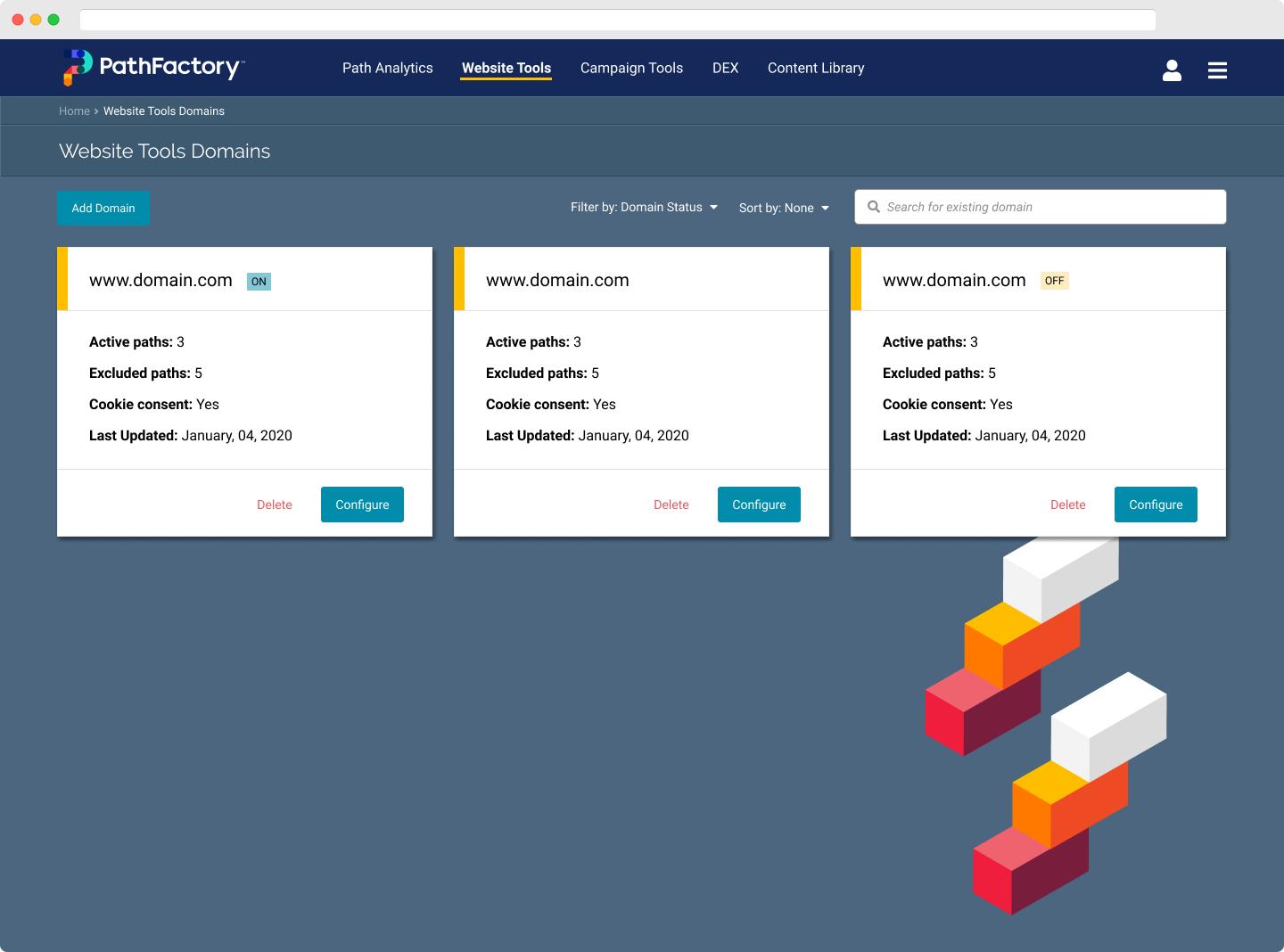
The result is an updated top-level navigation that provided “shelf-space” for users to see PathFactory’s full product suite, room for merchandizing (a high-profile ask by business stakeholders), and a modularized information architecture that accommodates future product growth.
In addition, we identified naming conventions that were confusing for marketers and were able to use that as a talking point with sales and product marketing teams to improve our product names.
Building out the Website Component Wizard
Methods: Facilitation, UX Strategy, Ideation & Prototyping, UI & UX Design
In general, the platform’s product patterns relies on a set of global parameters to create any of the assets a marketer user may need. That means that, before they can start on step one, the marketer must go into organization settings or cog menus first to make sure the scaffolding is there.
This pattern introduced a lot of friction to the process - something that is perceived as a simple, linear flow in fact required a lot of extra steps, often in completely different parts of the platform.
To solve this, we knew we had to reevaluate the fundamental patterns of the dashboard and adjust the product strategy. Through a series of informal workshops and working sessions I facilitated, we narrowed does the strategy and principles to the following:
We will limit how much we rely on global configurations to minimize the steps and keep users within the product module.
We will streamline key actions into one user flow to minimize distractions and improve usability.
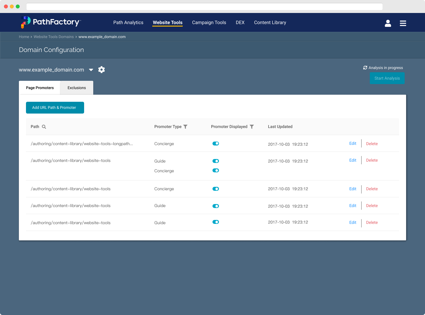
The key action is adding website components (i.e. widget and carousels) to a target website. Within a component, content that is analyzed by our engine will be delivered based on visitor firmographics.
From a marketer’s perspective, the more important tasks were:
Defining the page or path to insert a website component
Identifying what website component to insert
Identifying the type of content to serve (ex. personalized to the individual or trending among all visitors).
The solution was the Website Tools Wizard, with pulled the user away from the overall product module and allowed them to only focus on the tasks.
While we still had to rely on some existing global configurations due to technical constraints, we were able to pull some product-specific settings out of global settings pages and relocate it with the rest of the product.
In addition, we started using a new component library that allowed for more space and improved readability, a move that stepped away from the condensed, out-dated styling. The patterns created there served as the basis for new designs since its implementation.
Structuring content with Content Configurations
Methods: Facilitation, Information Architecture, Whiteboarding, UX Design
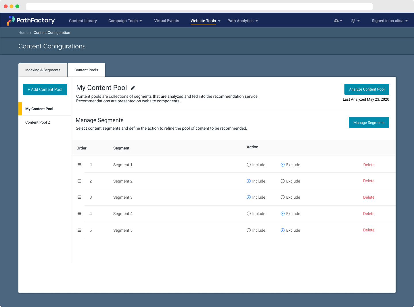
Following the initial launch, we learned that customers were asking for more granular and sophisticated controls over the content that wish to analyze. Rather than a one-and-done deal, as was previously designed, they were looking for controls such as inclusion and exclusion logic and content segmentation.
In addition, the engineering team was implementing a new backend architecture to support those requests. Due to the nature of the work, it was imperative that the design team had a strong grasp of the architecture and align with engineering regarding the user flow. The risk is a technology-first solution that deprioritizes user experience and comprehension.
With only 4 days to work on this, I first focused on facilitating conversations with the engineering and product stakeholders to ensure that the architecture supported an acceptable user workflow while supporting the correct data flow. The outcome of those conversations is diagrams that reflected what we discussed that became the basis of the screens and architecture.
At the same time, we worked on translating the layouts and patterns that were set in the Website Tools Wizard into Content Configuration, aligning them to the workflows identified in the cross-functional working sessions.
The biggest challenges while building this part of the project were:
Ensuring that the architecture was accurately represented on the UI
Learning the logic, identifying all possible edge cases, and defining a simple enough UI that reduces confusion.
The final solution is a new concept of content configuration that allowed users to manage segments at a high level, while also granularly managing low-level logic. Rather than a long, linear set of tasks, we knew that the steps were short and simple. Therefore, the solution relied on a strong layout and structure to orient the user, as opposed to a guided wizard to instruct the user.
Evaluating our success and learnings
Methods: Interviews
Following the implementation, I began conducting interviews with our customer success managers to answer the following research questions:
How do our customers use their websites? Did Website Tools meet their expectations?
What other tools do they use to enhance their website?
The goal is to understand the impact Website Tools had on their websites, workflows, and marketing goals. This was also an opportunity to catch up on research that we had to deprioritize at the beginning of the project.
While I didn’t get the chance to complete this research portion, I did learn the following:
Websites are highly political assets within a company. It is very possible that a “web team” owns the website, but the main users of PathFactory are content marketing or marketing operations teams. As such, Website Tools exists in between teams that may not usually work together.
The typical alternative to Website Tools components are custom-built UI components, which do not have “smart” or “automated” content delivery algorithms. Website Tools is on the right track.
In general, Website Tools meets our customers’ needs. However, we can do better with designing front-end components. We can learn from CMS design systems and patterns.
Want to learn more about this project?
There’s a lot more to this project that I wasn’t able to include in this short case study, including tools, detailed methods, challenges, and constraints.
I would love to talk to you about this project, what I learned, and more! Feel free to contact me on Twitter, LinkedIn, or using the contact form linked below.